- The quality of the photo.
- The emotional connection with the viewer.
- If it's something different.
- If it's something not seen before or in that perception.
- If it's unique.
- Does it engage the viewer.
- If it's interesting.
- If there is a story behind it.
Composition
Composition is made up of a lot of things. We can use composition to explain why a photo has a lot of value or doesn't have any value.
Composition is the action of putting things together, formation or construction. In photography, composition means putting together visual elements, contrast, leading the eye, viewpoints, balance, thirds and the golden ratio.
Visual Elements
The visual elements are used in a photo to give it value by texture, shape, line, colour, pattern, form, space and tone.

This picture has texture because it looks 3D and so it makes us think that if we felt it the image would be bumpy. Because it looks 3D it gives the photo form. It has tone because the shadows of the steps and the seats. It has shape because the shadows make the image look 3D.

This photo shows pattern, shape, line and colour to give it value. It has a checkered pattern, the shapes are all square, the lines form the squares and the colours of the squares are repeated through the photo. There are 5 squares of each colour which gives it a better effect.
The contrast is important in a picture because it makes certain colours stand out more and effects how we read an image. It makes certain colours stand out so that we go to those colours first.

This picture shows contrast because when I first looked at this picture I went to the bright blue first and then to the yellow second. This means that there is contrast in this picture because the bright blue is strikingly different to the yellow and stands out more.

This is a picture of my rabbit. This picture shows contrast because there is a bright white light behind her which is being reflected on the back ground. The rabbit has black fur and so it really stands out against the white background. The light also highlights the outline of the rabbit.
Leading the eye
Leading the eye is making the viewer look somewhere first and then making them travel through the image making their eyes go where the photographer wants.

This image is a great example because the lines of the red flowers and the lines in between them Leeds the eye towards the windmill. The red stands out more because warm colours appear closer and colder colours recede. After the viewer looks at the windmill they start to look at the sky and after that they look at the sides of the picture to see the different colours of flowers.

The viewer first looks at the photo at the top of the stalk and then they go down along the stalk to the bottom beans. This is because there is more space around the top beans and so there is more contrast with the light green and the back ground dark green. The shape of the top bean then leads the viewers eye down along the beans until they reach the end. When they get to the end they see the stalk which points up and so they go back up along the beans because the bottom beans point the way up.
Viewpoints
The viewpoint of an image is the angle of which the photograph was taken. It is the position which the photographer chooses to take the picture of the subject at.

This photo shows what the buildings would look like if we were looking up at the building while kneeling down. This makes the buildings look bigger then they are because the angle is lower than we would normally look at them from standing up.


This picture on the left demonstrates the viewpoint of making the object taller than it is. This happens because our depth cues perceive the top of the guitar as very far away because it is smaller than the bottom of the guitar. The image on the right demonstrates the viewpoint of making the object appear smaller than it is. This is because our depth cues perceive the top of the guitar as big and so we perceive it as nearer to us then the bottom of the guitar because it is smaller.

This is a picture of the guitar from a front on view so that we can see how tall the guitar really is and so we can compare it to the photos above.
Balance
Balance in photography is how symmetry, asymmetry and tension in the photo work together. If there isn't any balance in the photo then it creates tension. Balance is how the image is divided.
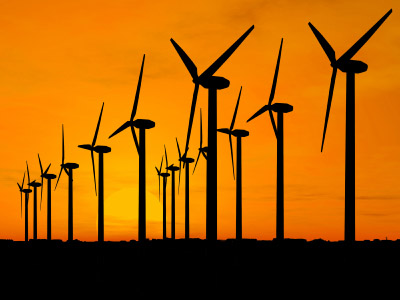
This picture has got balance because it has got the same amount of orange (the warm colour) as the black (cold colour). Also, there are the same amount of wind turbines and they are all in pairs of the same size.

In this picture, the yellow is a cold colour so it recedes but the red colour is warmer so it comes closer to the viewer. To balance these colours out I had to make the red colour smaller and the yellow colour bigger. This meant that when the viewer looks at the photo then they will go to one or the other but neither of them stand out so the viewer won't see one first every time they look at the photo.
Thirds
Thirds in a photo is how the foreground, middle ground and background have been composed. Structures shapes and tones are used to divide the image into sections as well.

This image shows the thirds by fore ground, middle ground and background as well as shapes and structures. The bottom third shows the yellow corn field behind the bird, this is the foreground. The The lighter blue background is the middle ground and the darker blue background is the background. The left third shows the foreground, middle ground and background, the middle third shows the bird as the shape and the right third shows the structure of the barbed wire and the bird.

The bottom third will be across the top of the donkey's head, the middle line will go across the donkey's back and along the fence, so the top line will be the field in the back ground. The first line vertical will go in the middle of the donkey's head, the second line will go along the donkey's last leg, this means the third section will be of the foreground, middle ground and back ground.
The golden section/ratio
This ration is said to be visually appealing when it is used in a photograph. Structures, shape and tone are used to divide the image into this ratio. The ratio is 1.61803399.
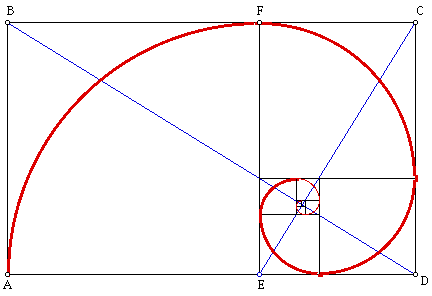
The golden ratio is 1,1,2,3,5,8,13,21...The ratio works by adding the numbers in front of it. 1+1=2, 1+2=3, 2+3=5...So the first square would be 1 by 1 and so would the next. The square after that would be 2 by 2 and so on. The squares are then placed in an order so that they make a spiral and the lines going diagonally.

This is a picture of The Parthenon which was built upon this ratio as seen by the golden section in white.


This photo also demonstrates the golden sector because the window in the top right is very small and 2 of them can fit into the window below it. The largest window is then next to the two windows and shows that it can fit the 2 windows next ot it. The windows are also in the right order because if there was an arch/spiral starting at the top left of the smallest window and then going to the right side, along the bottom, then up and along the left side.
This project has taught me a lot about composition and I will be sure to look at all of the different factors when I am taking a photo or evaluating one.
No comments:
Post a Comment